
Financial Platform Design System
Role: Lead UX/UI Designer
Company: Allvue Systems
Context
While working across multiple product workflows, our team relied on a shared Sketch file as a starting point. It lacked defined styling and system rules, so as designers worked independently, consistency began to drift.
This led to frequent review sessions and rework to realign designs, slowing overall progress.
During slower periods, I started building a design system in Sketch to bring more structure and consistency to our work. Over time, it evolved into a structured design system covering reusable components, interaction patterns, and visual standards across the platform.
I also met regularly with a developer to share progress and provide visibility into the system. While the Sketch system became fairly robust, it was not fully aligned with development due to time constraints and the effort required to map it to their existing variables.

My Contribution
As Lead UX/UI Designer, I defined and built a comprehensive design system that addressed both visual consistency and interaction behavior across the platform.
I also collaborated with two additional designers, providing guidance and structure for their contributions to ensure all components aligned with the system’s standards and patterns. This allowed the system to scale more efficiently while maintaining consistency.
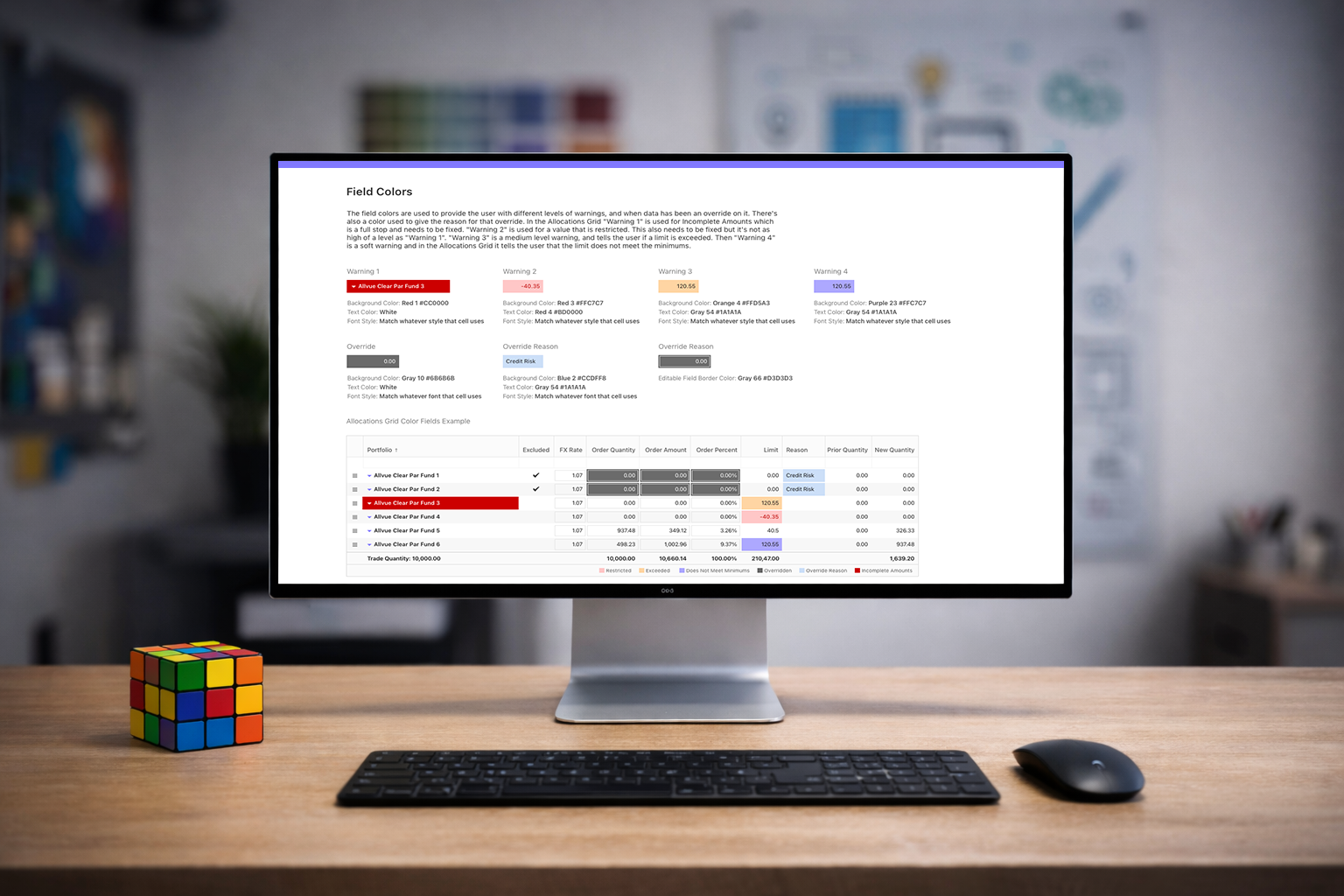
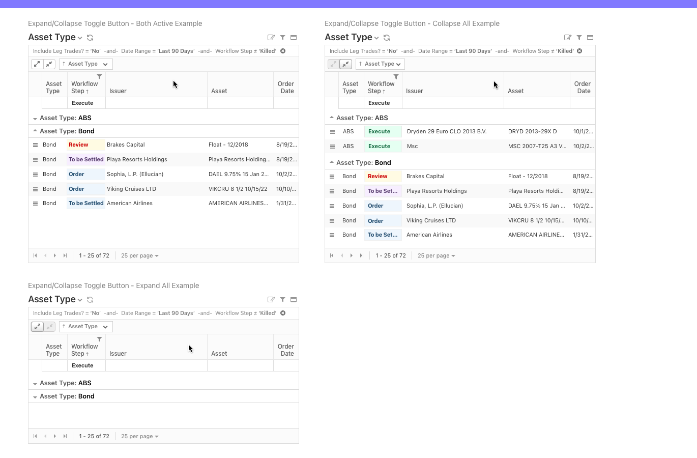
Data Tables & Editing States
Established a consistent structure for dense financial data tables, including typography, spacing, and hierarchy.
Defined clear interaction states for editing workflows:
- Introduced a visual indicator for unsaved changes using a corner marker, allowing users to quickly identify modified cells.
- Standardized hover, selected, and active states to improve readability in high-density views.
Focused on maintaining clarity without sacrificing the amount of data visible on screen.

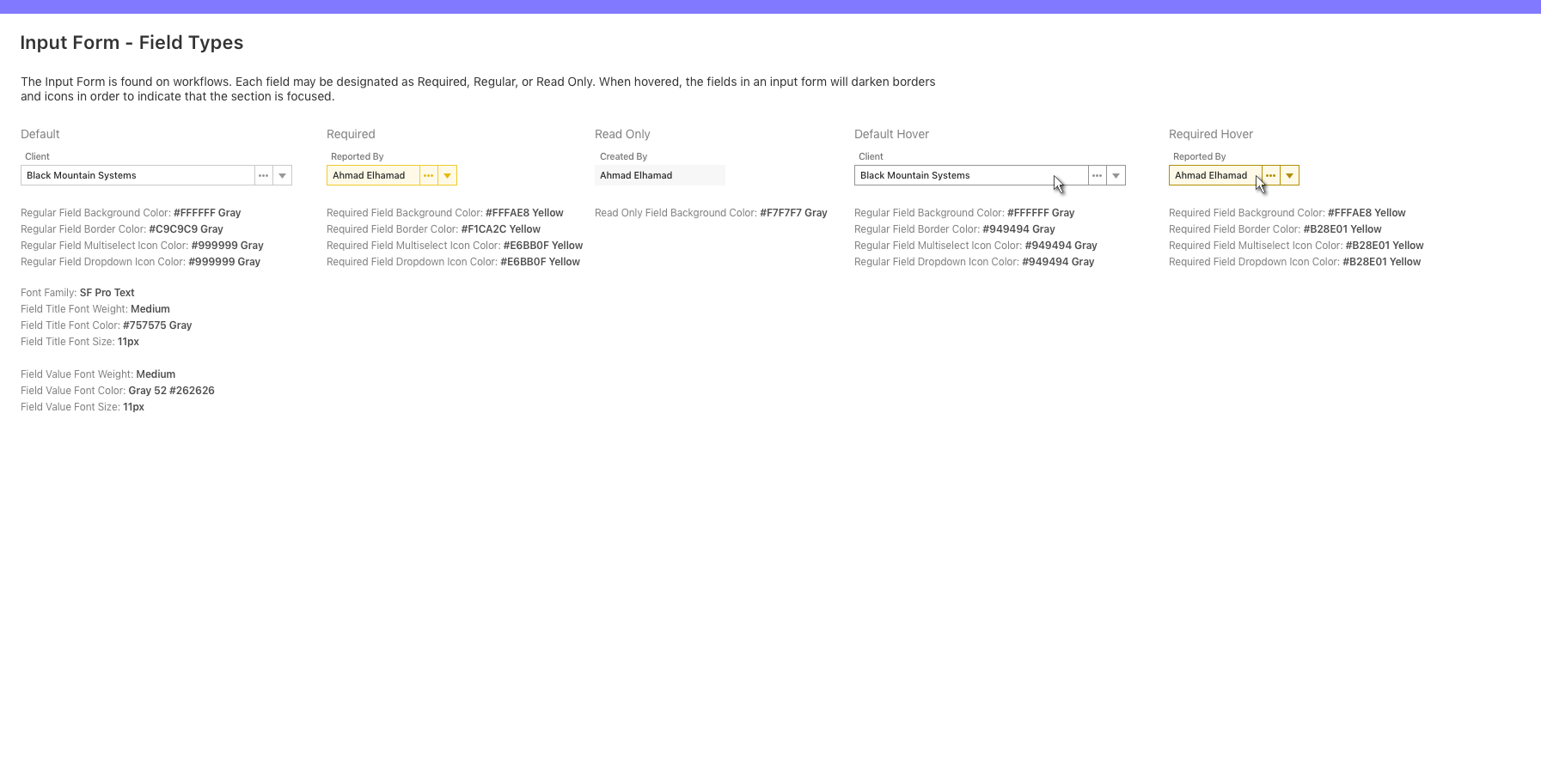
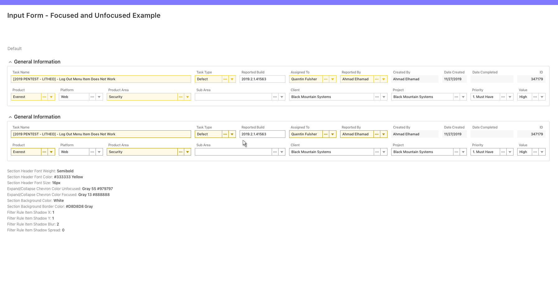
Form System & Field States
Designed a flexible input system to support various field types:
- Regular, Required, and Read-only states
- Clear visual differentiation using background color, borders, and icon treatments
Improved usability by:
- Defining consistent hover and focus behaviors across all inputs
- Making required fields immediately recognizable
- Reducing ambiguity between read-only and editable fields
Filters, Menus & Interaction Patterns
Standardized filter components and dropdown behaviors across workflows:
- Unified typography, spacing, and control styling
- Designed consistent operator selection and rule-building patterns
Defined interaction details such as:
- Hover states for menus and actions
- Visual feedback for selection and focus
- Clear hierarchy within complex dropdowns and popovers
This reduced the learning curve across different areas of the platform.

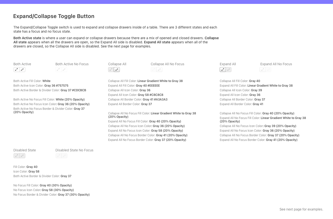
Navigation & Supporting Components
Created reusable patterns for:
- Contextual menus and secondary actions
- Inline links and supporting interactions
- Expand and collapse behaviors for grouped data
Ensured that all components followed a consistent interaction model, improving predictability across the platform.
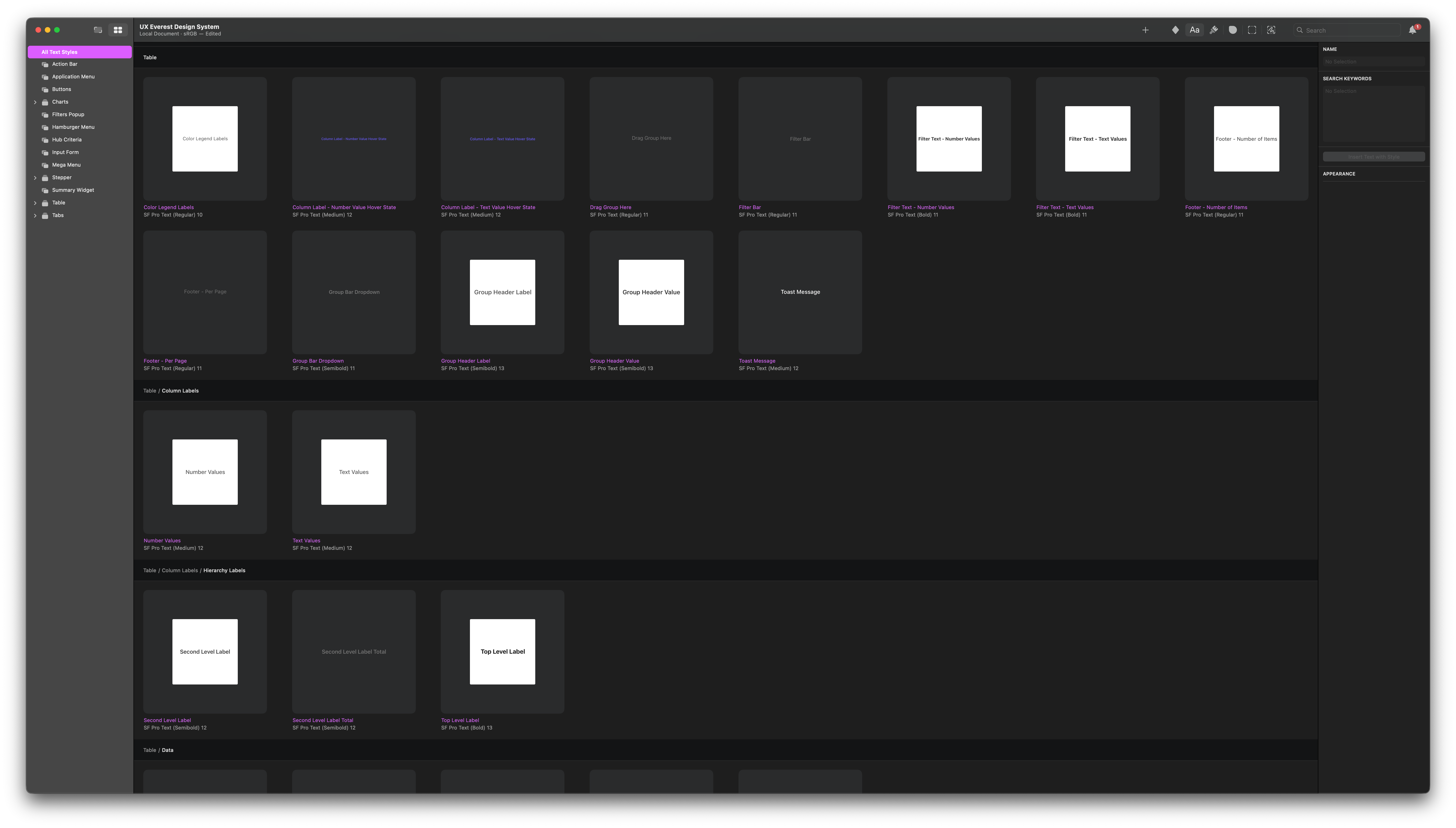
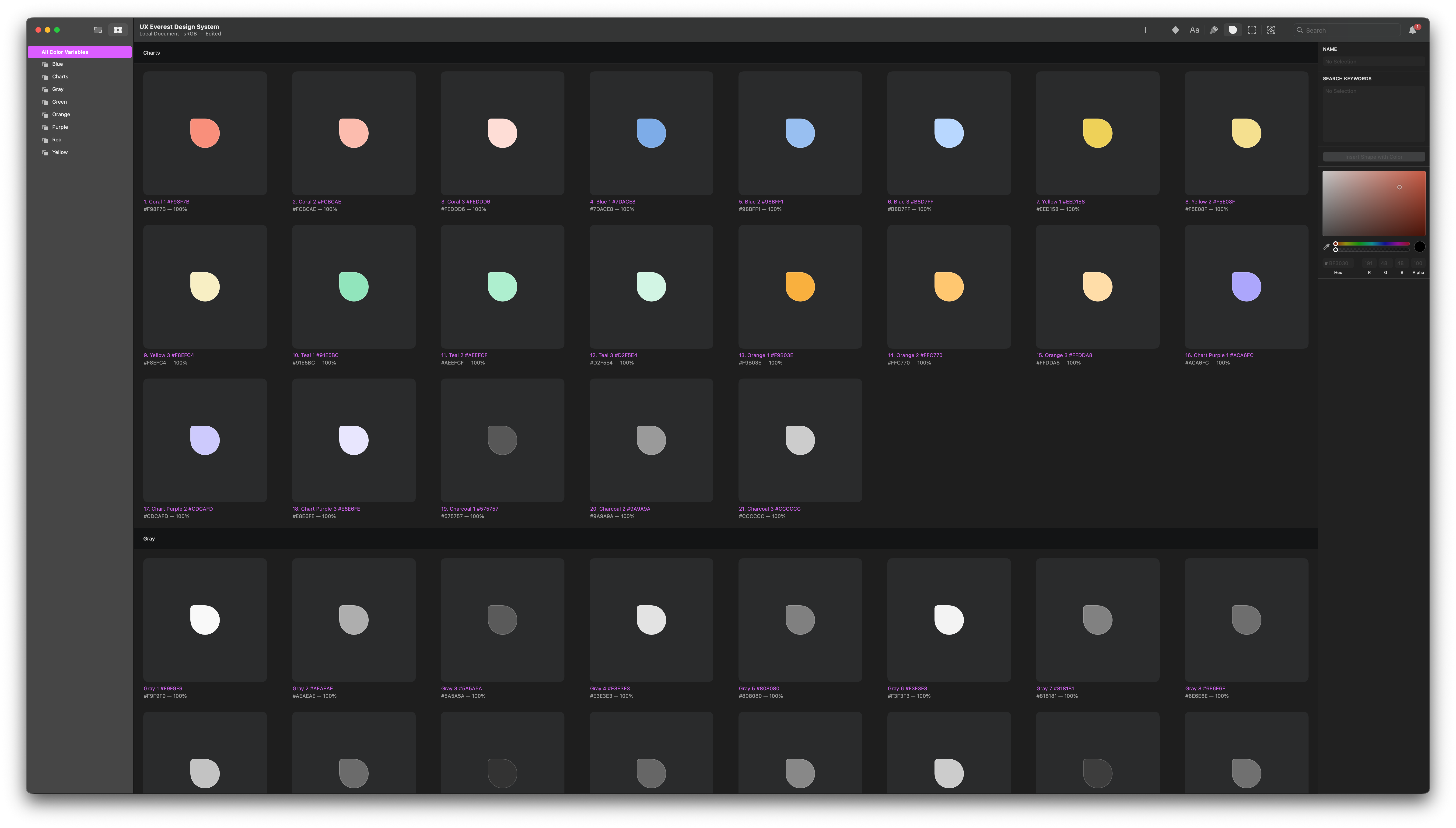
Design Tokens & Visual Language
Defined a cohesive visual system including:
- Color palette with functional usage across interaction states
- Typography system using SF Pro Text with defined weights and hierarchy
- Spacing, borders, and icon treatments
This allowed for:
- Faster design iteration
- Greater consistency across design work
- A clear foundation that could support future alignment with development
Process
I approached the design system as both a UX and scalability challenge, focusing on making complex workflows easier to use while creating patterns that could be reused across the platform.
Understanding the Current State
I spent time going through existing workflows to see where things were inconsistent across tables, forms, and interactions. I focused on the areas that caused the most confusion or slowed users down.
Defining Patterns
I looked for common behaviors and UI patterns across the platform and turned them into reusable components. A lot of the focus was on data heavy interfaces, frequent user actions, and tricky edge cases like editing and validation.
Collaboration & Guidance
I worked with two additional designers to expand the system, giving direction and feedback so everything stayed aligned and consistent as it grew.
Building the System in Sketch
I organized everything into a structured system with clear components and usage guidelines so it could be used consistently across the design team.
While a fully integrated design to development system was not completed due to time constraints, the design system provided a strong foundation that development teams could reference and build from.
Outcome
The design system created a unified foundation across multiple enterprise financial workflows.
- Reduced visual and interaction inconsistencies across workflows
- Improved usability in complex, data heavy interfaces
- Accelerated design workflows through reusable components and standardized patterns
- Decreased reliance on user training by making interactions more intuitive
The system established a scalable design foundation that supports continued product growth and future alignment with development systems.